Friday, November 09, 2012

West Point Flag

I was unable to get out during or after Hurricane Sandy to paint or take photos but I was able to paint a picture from a photo reference.  I wanted to make the shadows in the foreground darker, but I had to finish the painting by candle light.  It was difficult to tell how dark the area actually was.


                                          Watercolor on 120lbs paper 9x 12

In October of 2010 I had the opportunity to tour West Point and we took many photos, several of which I hope to paint.  Of the many incredible vistas, I was most taken by the scene of the American Flag on such a historic campus.  The grey flags made the whole scene seem even more solemn.

Friday, October 19, 2012

Autumn Tree

I am beginning to fall short of my goal of one painting per week, but I think this one gets me back on track.

I have been wanted to do a painting with a different color scheme than the last few and with the onset of Autumn, I have lots of choices. This is from a photo reference but I hope to be able to paint on sight in the near future.

                                    Watercolor on 140lbs paper 9x12

I definitely love the fall, with its beautiful colors and crisp weather (and of course football).  I am planning on doing a pastel painting in the near term as well but these quick watercolors have been a breath of fresh air for me.

Saturday, October 06, 2012

Our Old Shed

Our old shed sits in the corner of our yard and needs to be moved.  But to where is the question we are struggling with.  It is time to landscape the yard and add a patio and this old shed is sitting right dab in the middle of usable space.  Most likely we will use it to screen off the front yard. . .just not sure.

                                        Watercolor and ink on 140lbs paper 9x12

I have wanted to paint this scene for sometime, as I love how the dynamic shadows from our many trees flit throughout the yard during the day.  I tried something different with this one.  With all the other previous watercolor, I drew the picture (with varying level of details) in pencil, then painted.  I only inked the drawing from Munich after the watercolor was complete, leaving the paintings of Hawaii as watercolor only.  This time, I drew a rough picture in pen and ink, only using pencil to find my vanishing points and keep the picture's proper perspective.  The rest was free hand using a micron 05.  I can not tell you how satisfying this one was to complete.  I am very satisfied with the finished product.  This is more along the style that I was picturing for my "sketch crawl" pictures on location.
 

Sunday, September 30, 2012

Mokoli'i

Mokoli'i, also known as Chinaman's Hat, is an iconic basalt island off Oahu that has been used in many popular films.  The Kualoa Ranch (aka The Jurasic Park tour) uses it on its logo.  While on vacation, we did the four different tours at Kualoa including the Secret Island tour.  I took my paints, but did not paint.  However, I did take several (okay, lots and lots of) photos that I hope/plan to paint.  This is the first I hope many of paintings from those reference photos I took.

                                                         Watercolor on paper 9x12

I am not completely satisfied with this one and almost feel it is a step back in terms of technique (not every picture is going to be a winner; still learning watercolors after all).  I think the trees and sky, and even Mokoli'i itself is not bad. The water, however is rather flat and lacking (I was going to try using salt as a way to make it more interesting but forgot).  Perhaps I should try and rework it but I think I would rather move on to another subject, especially doing another painting en plein air.  
 

Wednesday, September 26, 2012

Aloha Oahu

Vacation.  What a wonderful thing. During my first ever trip to Hawai'i and the island of Oahu I was able to stick to my goal of completing a painting.  In fact, I was able to do two watercolor paintings.

                                                Watercolor on paper 10 x 7

This first painting, completed in about 40 minutes, is of the famous Diamond Head crater that overlooks Waikiki beach.  As I painted, I was amazed at how the ever changing cloud cover altered the look and feel of the mountain.  The clouds cast deep shadows on Diamond Head as they passed over and revealed deep craps when they floated by.

 
I sat balanced on these rocks, with my paints and pad on my lap.  At one point, I had two paint brushes chomped between my teeth.  It has to be one of the most precarious sitting positions that I have ever painted by.  As I was finishing, the tide was coming in and starting to splash me. If I had not finished when I did, I would have had to wade in the ocean to make it back to the beach.

                                      Watercolor on paper 10 x 7

This second painting is of the view from my hotel room.  I sat on the lanai, once again amazed at the wonderful clouds that appeared to be hooked to the mountains by gossamer strings.  Bob Ross would definitely love these happy little clouds.  This painting took about 45-50 minutes and shows, I think, my own personal evolution in painting with watercolor.  The colors are much less flat and much more dynamic than painting in Munich.  I choose to include the buildings, to one show scale and two because I am so horrible at painting buildings (this was a personal challenge).

Monday, September 03, 2012

Outside the Eurostar, Munich

There are many amazing old world buildings in Munich, displaying grand architecture and boasting rich histories, any of which are a source of artistic inspiration.  Alas, I only saw them during cab rides to and fro the convention center.  Therefore, in order to keep my goal of one painting/drawing per business trip, I had to go with what I had. . .the view outside the Eurostar Grand Hotel (I think this building, across the street from my hotel, was actually a prison).


I did the rough drawing while sitting in my hotel room, looking out the window, in between various business meetings, emails and recordings.  I briefly entertained the idea of venturing into the city proper, but it rained the only free day I had.  The painting was finished in the States, sitting outside of a lakehouse with its own majestic views (which, ironically, I neither drew nor painted. . .go figure).

The piece is rough, and the colors of uninked version rather flat yet at the same time satisfying and playful in their own way.  I am still learning and relearning how to paint in watercolor, and figuring out how to mix colors, something I do not really do in pastel.  The scribbled leaves were a great deal of fun.


Tuesday, August 14, 2012

Observations of the Natural World

I was stuck in Chicago for an extra day (I hate work travel that extends over the weekend but such is life). Since I had a pretty open schedule on Saturday, I decided to go to Blick Art on South State Street and bought a small travel watercolor set, pad and brush.  Taking advantage of the beautiful weather, I went to one of the parks by the Chicago Art Institute and painted one of the trees.  

                                     10x7 watercolor on paper

Not bad for an impulsive Saturday afternoon.  Below is a photo of the tree I painted and the sign outside the park.


Saturday, July 21, 2012

Painting Rocks


Not much movement on any real paintings (other than I have been getting all my watercolors together; apparently I have bought several sets [all unopened] in the last 5 years) but I did have the opportunity to paint rocks with my young niece.  She was very excited to finally paint with me.  I did the green dinosaur with the pink spots and she did the rainbow and flowers.


Truth be told, this was probably the most fun I had painting or "doing art" since college.  We are now on the look out for more suitable river rocks to paint (even though we can buy more at the store).

Tuesday, June 19, 2012

Hulk vs Rhino


So, I finally finished a pastel painting!  I had not realized, but looking back, the last pastel painting I did was in 2005.  It was the Song Bird in Blue.  How did that happen?  I have no idea but I am happy the long drought is over.  As with most things, this took longer than I had expected but I think it turned out well.  I am very happy with the final product.

This picture, which is a replication of the cover from Hulk #104 (June 1968), was my favorite comic book issues growing up.  I must have read this book hundreds of times until it was a battered, beat up mess.  I just loved the fight between the Hulk and the Rhino and how the Rhino, despite being severely over matched never gave up.  The Hulks ends up dragging the Rhino away from a burning jet liner that is about to explode.  Just a spectacular issue.  Growing up, I had always thought the issue and cover were drawn by Herb Trimpe (an underrated and under appreciated artist who had a great run on the Hulk).  However, when I went searching for a reference picture to paint I discovered it was drawn by amazing Marie Severin.  She was the Hulk artist as the book transitioned from Tales to Astonish to Hulk proper (with issue #102).

Monday, May 28, 2012

Color Blocking the Hulk

Color blocking is the next step in my process.  So, after the rough charcoal sketch, I begin to lay down color.  At this point, it does not matter if I get the exact color or not, I am just trying to block in the basic colors.  The painting will be worked and re-worked with workable fix, allowing for layer upon layer of color (without the painting become a muddled mess).  The directions of pastel strokes are varied and there is no blending.  I am even testing colors for the Hulk's skin tone, seeing how they look upon the pastel board.


The process continued as I laid down color on the figure of the Hulk.  At this point, I did not completely obliterate the charcoal under drawing so I could still see basic musculature.  The color of the foreground looks more orange than yellow of the above picture.  I guess I will have to be more consistent with light and flash when I take these photos.


Next, I began to blend the colors, to smooth out the rough pastel strokes.  I also switched from the harder Rembrandt to the softer Unison pastels.  From here on out, most of the work will be done with the Unison sticks.  I have some pastel pencils that I hope will allow me to do fine detail (on top of a layer of workable fix).  This is something I have never tried before as it was not necessary for the landscapes I had painted previously.  I am curious to see if I can pull this off.


When it stops raining, I will take this out side and hit it with the workable fix.  I hope to begin layering the details soon.

Thursday, May 17, 2012

The New Studio and a New Painting

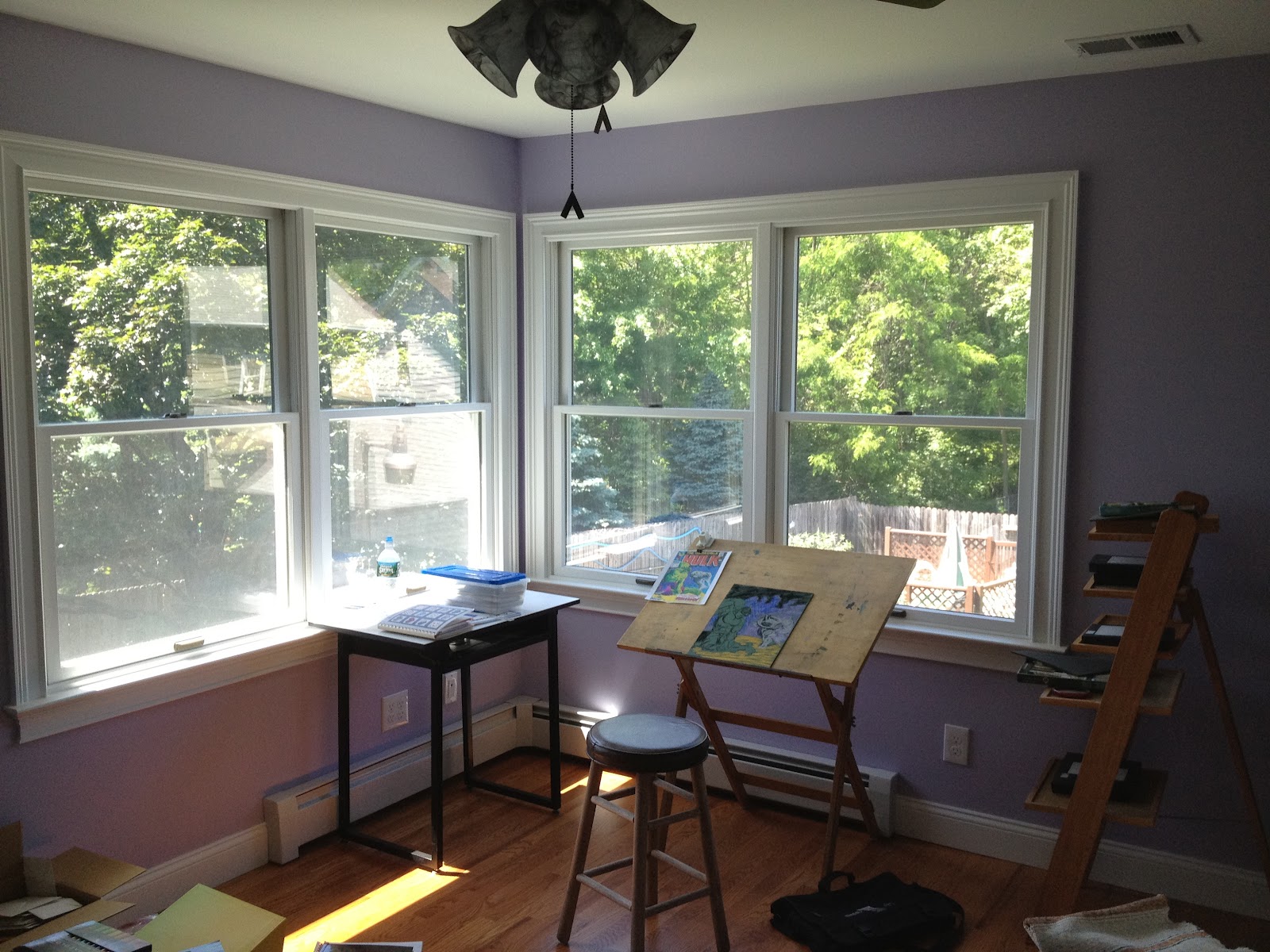
In the last post, I alluded to my new studio so I thought I would share some photos of what it looks like.  It was designed to maximize the natural sunlight light.  Most days I do not even need to turn on the lights to sit in there to read.  My drafting table and easel sit in the corner four windows.  The easel will be for mostly pastel painting and maybe, just maybe acrylic and oil paints if I ever get so inspired. The drafting table will be for pen & ink, colored pencil and watercolor.


If you look closely, you can see the beginnings of a new painting.  My work travel schedule has just been plain brutal, with trips to California and the West Coast in the same week as trips to Europe (not to mention all the weekends).  The net result is this painting is not as far along as I had hoped.  But I have started it and that is a victory in and of itself.

This charcoal sketch took less than 10 minutes to complete but I cannot tell you how satisfying it was.  I have always wanted to paint some classic Marvel covers in pastel much in the same way Alex Ross has done in oils.  Thus begins the process.

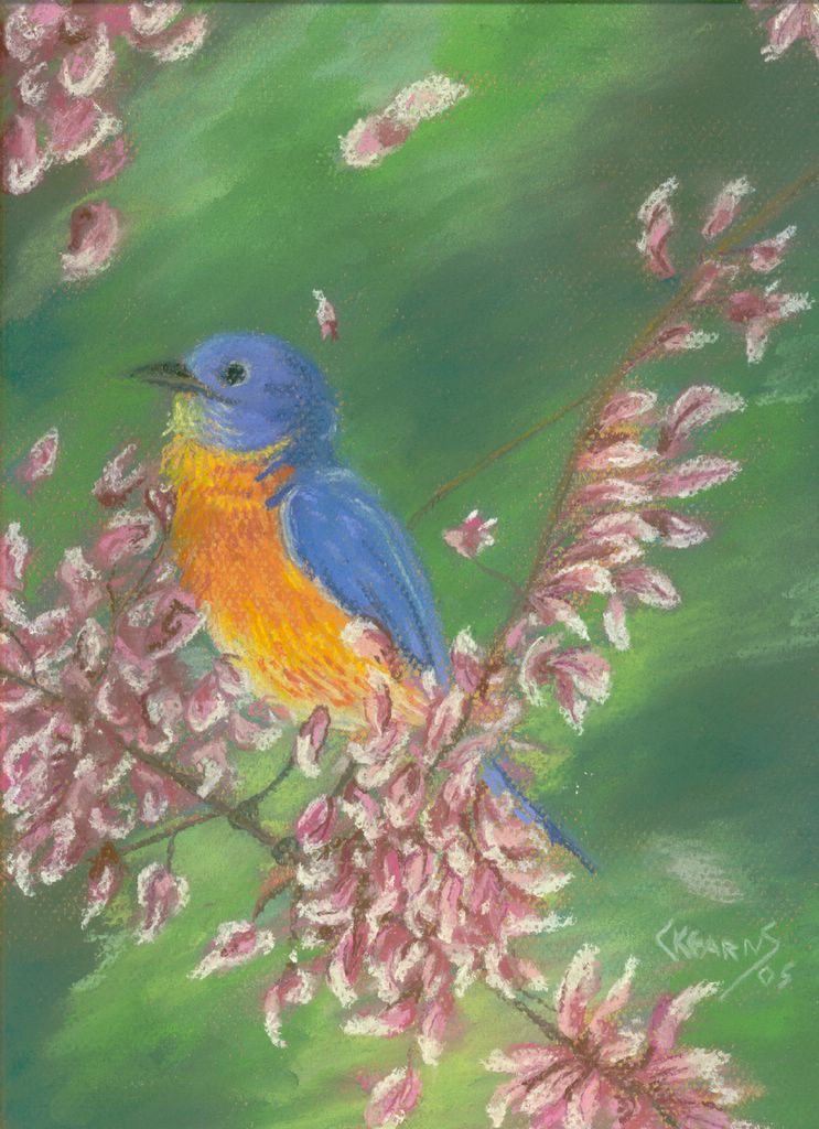
I will talk more about the choice of this cover and my hopeful process in completing this painting. 

Tuesday, May 08, 2012

Beginning the Process Once Again


So, after 2 years, 3 moves and building a new house from the ground up, I am once again ready to paint, draw, sketch and just plain try to be creative.  I have not painted anything with pastels in almost 5 years (how sad).

Before the Studio


The new house has a room set aside to be my studio, but before I was able to set it up I was drawing at the kitchen peninsula.  Not what I had initially intended, but a good place to start.


What to Draw? The Inspiration.

As I had not drawn anything in over 2 years, it felt as if my creative brain had atrophied. After several failed start/stops, I decided to use my favorite splash page from Mouse Guard as a kind of drawing exercise, much the same way one would do word problems to learn math skills.  I have done this from time to time when I am more interesting in learning a technique or playing with new tools or media.


The Tools

The last few Christmas I asked for and received many art supplies, including watercolor pencils, Cotman travel watercolors and micron Sakura Micron colored pens.  This choice of picture subject matter also allowed me to play with all these toys.


The Initial Drawing

The initial sketch was completed quickly and the drawing was inked with the Sakura micron pens (0.25, 0.45 and 0.50 mm black). Simple, yet fun.


The picture was painted using a combination of the watercolor pencils and Cotman pans.  I used the colored microns to add details to the leaves in the tree and on the sword.  David Petersen, the creator-artist of Mouse Guard, is such a talented artist, even my pale copy of his his wonderful work is actually pretty good.  Eventually, I will create original works using this technique, which was quite fun and can be done virtually anywhere.